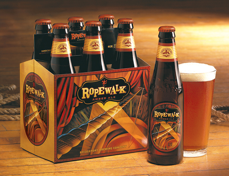
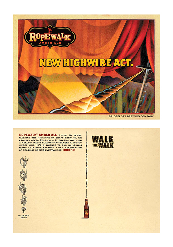
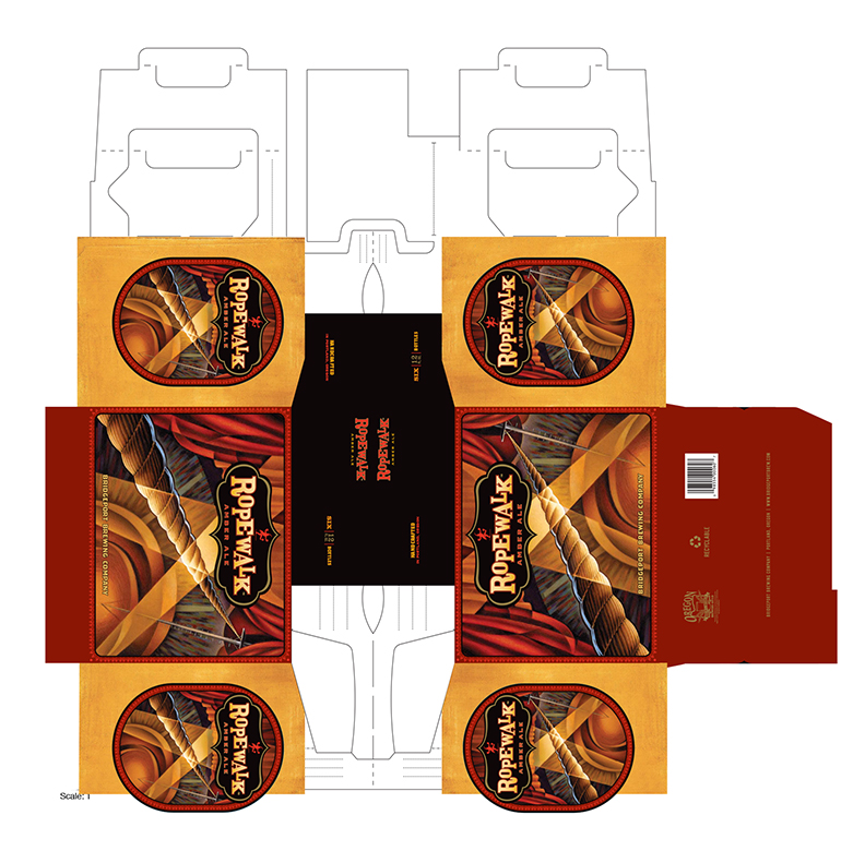
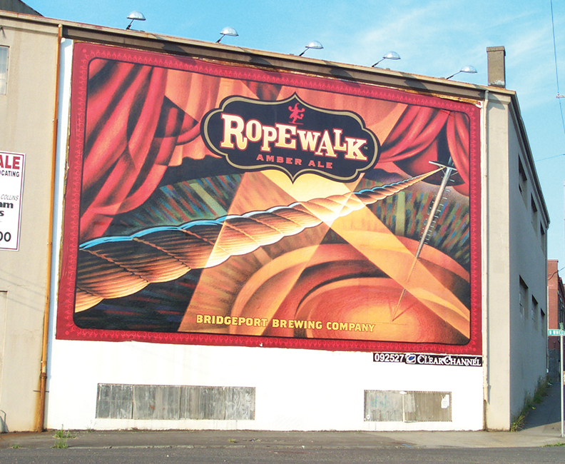
Bridgeport Brewing was the oldest microbrewery in Oregon and had a brand look for all their labels. Ropewalk was a new ale coming out. The brew was named in part for the old rope factory building that was home to the brewery. Their ad agency, CMD, directed Dotzero Design to give the beer a unique logo that didn’t follow the brand of the brewery or its other labels, capturing some of the feel of a carnival or circus – a tight rope walker kind of idea. The label and packaging illustration of a circus tent high wire was done by illustrator Jeff Foster. The logo employed a bit of an exotic shape (at least at that time) along with some fun type play. It was used not only on the labels and packages, but also on shirts, glasses, tap handle, etc.
